


We all agree by now that web design has to be built around the user, taking into account their goals, their expectations but also their difficulties.
Every designer has a duty to carefully assess the group of people he or she is designing for and get to know them better through research. However, mistakes are often made in identifying the target user group: one of these is to limit oneself to considering only ‘typical users’, ignoring other categories which are automatically excluded.
This is certainly limiting for those who are not taken into account during the design process, because they will end up with a product or service that has not been designed for them and therefore potentially less easy to interact with.
This is where the concept of accessibility comes in.
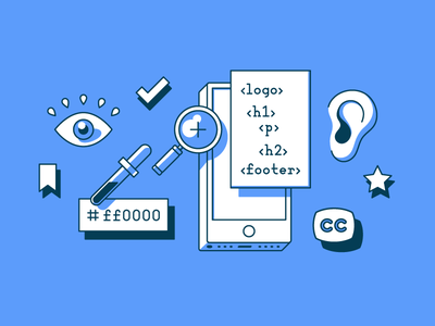
What is accessibility and why is it important?
Accessibility means the ability of a product, service or environment to be easily usable by any user who happens to use it, or at least by most users.
Making something accessible also means providing everyone with the same opportunities and rights.
This definition is particularly used with reference to equal opportunities for people with disabilities to experience the web by removing barriers that do not allow them to interact or access it.
It is therefore a matter of not only designing for the majority, but also considering the minority.
Accessibility on the Web
The Web offers many opportunities, but they are not accessible to everyone. Although it has made life easier for many people with disabilities, web accessibility is still a principle that is not always properly considered.
This gap, between those who have the ability to access web resources independently and those who cannot because of some disability, is called the Web Accessibility Divide.
The World Wide Web Consortium (W3C), the organisation responsible for issuing and disseminating standards that help make the web accessible, has set out the four principles of accessibility that make a site accessible:
- Perceivable — The information and user interface must be presented in a way that can be perceived by users. This means that users must be able to perceive the information presented (it cannot be invisible to all their senses).
- Operable — User interface components and navigation must be operable. Users must therefore be in a position to use the interface and possible interactions must be actually executable.
- Understandable — The information and operation of the interface must be comprehensible.
- Robust — Content must be able to be reliably interpreted by a variety of agents, including assistive technologies. It must be accessible even as technology advances.
The W3C has published a set of guidelines that are constantly being updated: Web Content Accessibility Guidelines (WCAG) 2.1. WCAG 2.1 success criteria covers a wide range of recommendations for making Web content more accessible and they are written as testable statements that are not technology-specific.
In the following paragraphs, we will look at these guidelines from a more practical point of view.
Assistive technologies
It seems only fair to say a few words about assistive technologies. Assistive technologies are IT tools designed to facilitate the integration of disabled people in the use of hardware and software. They should not be confused with what are called “aids” such as wheelchairs or prostheses. Assistive technologies are interfaces that are installed on a ‘standard’ system, such as a computer or smartphone, in order to make it more usable and accessible.
Here are some examples:
- Alternative browsers
- Applications that work by tracking eye movements and eyelid closures (eye-tracker)
- Personalised keyboards
- Ergonomic mouse
- Pressure sensors
- Screen readers, i.e. softwares that use the braille writing system or read text aloud.
So, what can we do as designers to make a service (or a product) accessible?
Let us move on to the facts!
Accessibility allows all (really all!) users to understand, use and enjoy the web. As designers, it is our responsibility to make sure we design in a way that is usable by all users, regardless of their situation, ability or context.
As designers, it is our responsibility to make sure we design in a way that is usable by all users, regardless of their situation, ability or context.
The first and most important step in building an accessible product is to build empathy and have an inclusive design mindset.
As I said, accessibility is not limited to a group of users with a few different abilities (for example, visual, motor, hearing, speech or cognitive disabilities), but extends to anyone experiencing any permanent, temporary or situational disability. For example, having only one arm is a permanent condition, having an injured arm is a temporary condition, and holding a child with one arm is situational — in each case the user is able to complete tasks with one hand.
Therefore, the aim is to make web content more usable by users in general.
After reading the WCAG 2.1 guidelines, we can outline a set of guidelines that we can follow as UX designers while designing.
Content and structure

Make links meaningful
Avoid using links that say ‘Click here’ or content-less text such as ‘More details’ applied to a list of links.
Benefits: This helps users with cognitive limitations or visual impairments, helping them to avoid unnecessary keystrokes to visit content that is not relevant to them.
Reference: WCAG 2.1 — Link purpose (in context)
Use colour in a relevant way
Do not specify important information with colour alone. Use a combination of text, colour or graphic objects.
Benefits: Useful for users with partial vision or limited colour vision, colour blindness and for users using text-only, limited colour or monochrome screens.
Reference: WCAG 2.1 — Use of Colour
Make navigation consistent
Ensure that repeated components appear in the same order on each page of the site.
Benefits: It is useful for users with cognitive limitations, low vision and intellectual disabilities because it becomes easier to predict where they can find things on each page.
Reference: WCAG 2.1 — Consistent Navigation
Create consistent components
UI components that have the same functionality should be consistent. Maintaining a design system, pattern library or style guide is encouraged to maintain consistency across the team. If icons or other non-textual content have the same functionality, then their textual alternatives should also be consistent.
Benefits: Consistent use of components with the same functionality helps users to identify components on different pages with the desired functionality. People with text reading difficulties are highly benefited by this. Keeping labels consistent also helps to achieve a more predictable experience.
Reference: WCAG 2.1 — Consistent Identification
Use headings in the right way
Use descriptive and informative page titles. Page headers and form labels should be informative. Make sure that the structure of the headings (h1-h6) is correct.
Benefits: This may help users with limited short term memory, low vision or difficulty reading text — they may only see a few words at a time and know the purpose of each section.
References: WCAG 2.1 — Headings and Labels; WCAG 2.1 — Section Headings; WCAG 2.1 — Page titled
Multiple ways
There should be more than one way available to locate a web page within a set of web pages. Exceptions: when the web page is part of a process such as a checkout page.
Benefits: This helps to find information faster, which helps users with visual impairments or cognitive limitations.
Reference: WCAG 2.1 — Multiple Ways
Device independent design
Make it easier for users to use the functionality through various inputs.
Interactions
Don’t rely on device-dependent interactions (e.g. hover) to convey information or complete tasks. If hover or focus design is really necessary, then design the interaction in such a way that users can perceive the additional content and dismiss it without interrupting their experience on the page.
Benefits: This can help users with visual or cognitive disabilities — they can have adequate time to perceive the additional content that appears on hover or focus and to view the activation content with less distraction.
Reference: WCAG 2.1 — Content on hover or focus
Sensory characteristics
Do not provide instructions that rely only on the sensory characteristics of components such as shape, colour, size, visual position, orientation or sound. For example: use a combination of positioning, colour and labelling to identify the content.
Benefits: Blind or visually impaired people may not be able to understand information if it is conveyed by shape and/or position. Providing additional information will enable them to understand the information conveyed.
Reference: WCAG 2.1 — Sensory characteristics
Give alternatives to device motion
If device movement is used to activate a feature, then ensure that you provide an alternative user interface for the feature or allow the user to disable the activation of the feature movement.
Benefits: This helps users who are unable to perform particular movements (such as tilting, shaking or gesturing) because the device may be mounted or users may be physically unable to perform the necessary movement. A general benefit could be in situations where users are unable to hold and move the device.
Reference: WCAG 2.1 — Motion actuation
Avoid complex pointer gestures (or give a single pointer alternative)
If you require the use of complex gestures, then also provide a single pointer alternative. For example: a map view that supports gestures to zoom and drag to move the visible area. The keyboard buttons offer operation via [ + ] and [ — ] buttons to zoom in and out, and arrow buttons to pan in all directions.
Benefits: Users with cognitive or learning disabilities, or who cannot perform complex gestures, will have alternative means of interacting with content.
Reference: WCAG 2.1 — Pointer Gestures
Content orientation
Do not limit your design to portrait or landscape orientation only, unless a specific orientation is required.
Benefits: This can be useful for users with dexterity impairments— who have a device mounted in a fixed orientation to display content. Visually impaired users can also view content in an orientation that is most congenial to them.
Reference: WCAG 2.1 — Orientation
For Keyboard-only users
Make sure that users can interact with your page using only the keyboard.
Design visible focus states
Clearly define and design the focus status of input elements. Change of content, such as text, should not occur at the focus.
Benefits: Users with limitations in attention, short-term memory or executive processes benefit from being able to discover where the focus is. This also helps users with visual impairments, cognitive and motor limitations by reducing the possibility of a change of context occurring unexpectedly.
References: WCAG 2.1 — On focus; WCAG 2.1 — Focus visible
Define keyboard shortcuts
Define shortcuts that can be easily used with one hand for common operations. Make use of some common keyboard shortcuts, without conflicting with existing browser and screen reader shortcuts.
Single key shortcuts can cause problems for users with voice input, so a mechanism should be provided to disable this if necessary.
Benefits: This improves usability for users using only the keyboard. However, users using only voice commands or only the keyboard are prone to accidentally hitting keys — so a mechanism should be provided to disable shortcuts.
Reference: WCAG 2.1 — Character key shortcuts
Create a logical tabbing order
Uses a logical keyboard navigation order. When navigating in a window with the Tab key, the keyboard focus should move between controls in a predictable order.
Benefits: A logical order of focus helps users with mobility problems, users with disabilities that make reading difficult, users with visual impairments. A meaningful sequence helps users who rely on assistive technologies that read content aloud.
References: WCAG 2.1 —Focus order; WCAG 2.1 — Meaningful Sequence
Provide a skip link
Include a “Skip to main content” link before the header for keyboard users, visible only when in focus.
Benefits: Keyboard users can reach the content with fewer keystrokes. Screen reader users can easily skip some sections that are not relevant to them.
Reference: WCAG 2.1 — Bypass blocks
Touch target
Ensure that touch targets are at least 9 x 9 mm, regardless of screen size, device or resolution.
Leave enough inactive space around the controls so that they do not overlap with other targets.
Benefits: It is useful for users with mobility problems such as hand tremor or who have large fingers, users who use a mobile device in environments such as public transport or users who access a device using only one hand. Visually impaired users can see the target better.
References: WCAG Mobile accessibility mapping — Size and spacing of touch target; WCAG 2.1 — Target size
Give users advanced warning when opening a new window
Opening a link in a new browser window can be disorienting for screen reader users or users with cognitive disabilities.
If you have to do this, warn the user before they click on the link that it will open in a new window. You can use text such as ‘opens in a new window’ or a visual icon. If you choose to use an icon, make sure it is accessible to screen reader users.
Benefits: This helps users by presenting content in a predictable order from one web page to another.
Reference: WCAG Technique — Giving users notice before opening a new window
Animations
Design the content in a way that does not cause convulsions.
No content on the page should flash more than 3 times per second unless the flashing content is small enough and the flashes are low contrast and do not contain too much red.
Benefits: Individuals who have convulsions, photosensitive epilepsy or any other photosensitive disorder would be able to enjoy the whole experience of the site.
References: WCAG 2.1 — Seizures and physical reactions; WCAG 2.1 — Three flashes or below treshold; WCAG 2.1 — Three flashes
Layout

Linear and consistent
Create content that can be presented in different ways (e.g. a simpler layout) without losing information or structure.
Be clear in your writing; avoid jargon and idioms.
Benefits: This is useful for users using screen readers, for users with visual impairments or on the autistic spectrum. Keeping content clear and short helps users with dyslexia.
References: WCAG Mobile accessibility mapping: Consistent layout; WCAG 2.1 — Info and relationships
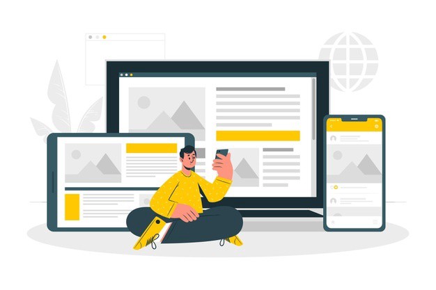
Responsive design
Consider mobile and content relevance from the beginning of layout design. (Mobile-first design)
Benefits: This allows the content to enlarge and respond to various screen sizes without loss of information or functionality and without scrolling in two dimensions, helping users with visual, physical or motor disabilities.
Reference: WCAG 2.1 — Reflow
Media
Provide alternative text for images
Alternative text is read by screen reader users. Images that do not convey any content and are used for decorative purposes should not be announced by the screen reader.
Make sure there is enough description for the images provided for the screen reader.
Benefits: This helps people who have difficulties perceiving visual content. Assistive technology can read text aloud, present it visually or convert it to braille. People who have difficulty understanding audio information can read the text presentation.
Reference: WCAG 2.1 — Non-text content
Give users enough time to read and use the content
Allow the user to pause, stop or hide content that moves, blinks, scrolls or updates automatically.
Benefits: People with reading disabilities, cognitive limitations, learning disabilities or any physical disability often need more time to react, type and complete tasks. Control over time limits is also important in situations where an interpreter is required.
References: WCAG 2.1 — Pause, stop, hide; WCAG 2.1 — Time adjustable
Make audio or video elements accessible
Make sure you provide an alternative for pre-recorded audio only, e.g. text transcripts. Provide captions for pre-recorded audio content.
Provide an alternative for timed media or an audio track and audio description for pre-recorded video only.
Benefits: Assistive technology can read text alternatives aloud, present them visually or convert them to braille. People who are deaf or hard of hearing can read the text presentation or can access auditory information through captions.
References: WCAG 2.1: Audio only video only — Prerecorded ;WCAG 2.1: Captions prerecorded ; WCAG 2.1: Audio description — Prerecorded
Take care of typography
Line spacing should be at least 1.5 times the font size. Paragraph spacing should be at least 2 times the font size.
Letter spacing (tracking) should be at least 0.12 times the font size. Spacing between words should be at least 0.16 times the font size.
Characters should not be smaller than 10 pt.
Benefits: This is useful for people with low vision, dyslexia — the extra space between lines, words and letters helps them to read the text. White space between text blocks can help people with cognitive disabilities to discern sections and recall boxes.
Reference: WCAG2.1 — Text Spacing
Use adequate colour contrast
Text should have a colour contrast ratio of at least 4.5:1 to its background.
The contrast of icons and graphic objects should be at least 3:1 with respect to the adjacent colour(s).
Large-scale text should have a contrast ratio of at least 3:1.
If the text is part of a logo or trademark, then it does not meet a minimum contrast requirement.
Benefits: This helps visually impaired people who often have difficulty reading text or perceiving graphics that have insufficient contrast.
References: WCAG 2.1: Contrast Minimum; WCAG 2.1: Non-text contrast
Design for forms
Help users understand various inputs, and help them avoid and correct mistakes. There are some key points to be kept in mind while designing a form:
- Form labels and placeholder inputs: Use a label instead of a placeholder to give important information about the field.
- Help text/Instructions: Add appropriate instructions and help text, if necessary.
- Sensible grouping: Common or related elements should be grouped correctly.
- Error messages should not be in colour alone. An informative text should be provided that helps the user to rectify the error.
- Captcha: Captchas are highly controversial in the accessibility world. If you still want to use it, provide text alternatives that identify and describe its purpose.
- Users should be allowed to review, confirm and rectify information before finalising submission.
Reference: WCAG 2.1: On Input; WCAG 2.1: Non-text content
User Research & Testing
Research
- Cover accessibility and inclusive design issues when conducting user research. Consider potential visual, hearing, motor, and cognitive disabilities.
- Incorporate accessibility considerations in your personas, or user stories.
- When possible, include users with different abilities in user research.
Reference: Personas for accessible UX
Conclusions
Making a website, application or web product accessible is a benefit to all users, not just those with sensory, motor or cognitive disabilities.
All of us, for example, surf the web when we are tired or distracted: accessibility measures can certainly help us when our concentration is not at its best.
Finally, never forget that accessibility does not consist of a series of add-ons, but is a way of designing that must be extended to the whole process from the earliest stages.
References
- Accessibility guidelines for UX Designers — https://uxdesign.cc/accessibility-guidelines-for-a-ux-designer-c3ba775539be
- Designing for accessibility is not that hard — https://uxdesign.cc/designing-for-accessibility-is-not-that-hard-c04cc4779d94
- Designing for Web Accessibility — https://www.w3.org/WAI/tips/designing/
- WebAIM’s WCAG 2 Checklist — https://webaim.org/standards/wcag/checklist
Further reading
- UX and the Importance of Web Accessibility — https://www.toptal.com/designers/ui/importance-web-accessibility
