


As I have already mentioned in the article UX and Accessibility: a practical guide for designers, designers can and have to play their part in making digital products accessible.
When developing or redesigning a website or web application, it is crucial to assess accessibility at the beginning and throughout the development process to identify accessibility problems in time, when it is easier to address them.
There are tools that can help in the evaluation. However, no one tool alone can determine whether a site meets accessibility standards.
A competent assessment by a human being is essential to determine whether a site is accessible or not.
Let us now look at the steps to be taken to conduct an accessibility evaluation.
Initial checks
It is useful to specify that these initial checks only cover some accessibility issues and are designed to be quick and easy, rather than definitive.
A web page may apparently pass these checks, but still have significant accessibility barriers. A more robust assessment is required to fully evaluate accessibility.
A good ally for conducting initial evaluations is the WAVE tool, of which there is an extension for Chrome and Firefox.
For further support, you can also watch explanatory videos provided by the W3C.
Page titles
Page titles have to be:
- shown in the window title bar in some browsers
- shown in browser tabs when multiple web pages are open
- shown in search engine results
- used for browser bookmarks/preferences
- read by screen readers
- In web page markup they are the <title> within the <head> tag.
Good page titles are particularly important for orientation — to help people know where they are and move between the pages opened in their browser. The first thing screen readers read when the user moves to another web page is the page title.
What to do
- Look at the title of the page (if you have a screen reader, listen to it)
- Look at the titles of the other pages on the site
What to check for
- Check that there is a title that adequately and briefly describes the content of the page
- Check that the title is different from the other pages on the website and that it adequately distinguishes the page from the other web pages
Tips
There is flexibility on what makes a good page title.
Best practice is for titles to be ‘front-loaded’ with important and unique identifying information.
Some examples of unsuitable titles:
- Welcome to the home page of Acme Web Solutions, Inc.
- Acme Web Solutions, Inc. | About Us
- Acme Web Solutions, Inc. | Contact Us
- Acme Web Solutions, Inc. | History
Examples of more appropriate titles:
- Acme ceb Solutions home page
- About Acme Web Solutions
- Contact Acme Web Solutions
- History of Acme Web Solutions
Reference
Understanding Success Criterion 2.4.2 for WCAG (Level A)

Image text alternatives (“alt text”)
Text alternatives (“alt text”) convey the purpose of an image, including pictures, illustrations, graphics, etc.
Text alternatives are used by users who cannot see the images, e.g. blind people using screen readers can hear the alternative text; and people who have switched off images to speed up downloads or save bandwidth can see the alternative text.
The text should be functional and provide an equivalent user experience, not just a description of the image. (For example, the appropriate alternative text for a search button should be “search”, not “magnifying glass”).
You don’t usually see the alt text on a web page, but it is found in the markup of the page. Every image should include the alt in the markup.
If an image conveys information that is useful for interacting with or understanding the content of the web page, then it needs alt text.
If an image is just decorative and people don’t need to know about the image, then it should have null alt text (alt=“ ”).
Automatic tests can tell us if alt text is missing from images. To determine whether alt text is appropriate, we need to look at the image and judge it in context.
What to check for
Check that each image has an appropriate alternative text.
Tips
Appropriate alternative text is not an exact science. Some people prefer most images to have a more detailed description; and others prefer much less description.
Here are some tips for writing an appropriate alternative text:
- The text must convey the same meaning as the image. That is, if someone cannot see the image, they get the important information from the image in the alternative text.
- The alternative text depends on the context. For example, for an image of a dog on a kennel club website, the alternative text might include the breed of dog; however, the same image on a dog park website might be there just to make the page more attractive, and the image might not need any alternative text (and should have null alt). One way to help think about appropriate alt text is: if you were helping someone read and interact with the web page and they couldn’t see it, what would you say about the image?
- Images that are functional — for example, images that initiate actions (such as submit buttons) and linked images (such as in navigation) — need alt text that is the functional equivalent.
- If there is text in the image — for example, in a logo — that text must be included in the alt text.
- If the image has complex information — such as diagrams or graphs — the image should have a short alt text to identify the image, and then the detailed description of the information should be provided elsewhere (for example, in a data table).
What is not needed in alt text
- If the image is not important for understanding the content — for example, it is just a decoration or an “eye-catcher” — it should have null alt text (alt=“ ”). One way to help determine whether an image should have zero alt is to ask: If the image were removed, would the user still get all the information from the page?
- The alt text does not need to include the words “button”, “link”, or “image of” (screen readers automatically provide this information).
- If the image is sufficiently described in the text — for example, a simple diagram illustrating what is written in the text of the web page — it can have a short alternative text such as “Workflow diagram as described above”.
Alt attribute in HTML (not “alt tag”)
In HTML, alt is an attribute of the image element, and of other elements. So “alt tag” is technically incorrect; the correct terminology is “alt attribute”, or you can say “alt text”). It looks like this in markup: <img alt=”Brand logo” src=”/brand/logo.png”>
References
- Text alternatives for non-text content
- Non-text Content — Understanding Success Criterion 1.1.1 for WCAG (Level A)
- An alt text decision tree
Headings
Web pages often have sections of information separated by visual headings, e.g. headline text is larger and in bold.
To make these work for everyone, headings need to be marked. This way people can navigate to the headings — including people who cannot use a mouse and only use the keyboard, and users who use a screen reader.
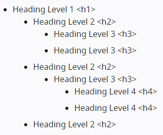
Heading levels should have a meaningful hierarchy, e.g.:
What to check for
- Each page must have a title.
- All text that looks like a heading must be marked as a heading.
- All text that is marked as a heading must actually be a conceptual heading for a section.
- The hierarchy of headings must be meaningful. Ideally, the page should start with an “h1” — which is usually the title of the page — and not skip levels.
However, these are not absolute requirements.
References
- Info and Relationships — Understanding Success Criterion 1.3.1 for WCAG (Level A)
- Headings and Labels — Understanding Success Criterion 2.4.6 for WCAG (Level AA)
- Section Headings — Understanding Success Criterion 2.4.10 for WCAG (Level AAA)
Contrast ratio (colour contrast)
Some people cannot read text if there is not enough contrast between the text and the background, e.g. light grey text on a light background.
High contrast (e.g. dark text on light background or light text on dark background) is required by some people with visual impairments, including many older people who lose contrast sensitivity due to ageing.
While some people need high contrast, for others — including some people with reading disabilities such as dyslexia — bright colours (high luminance) are not readable. They need low luminance.
Web browsers should allow people to change the colour of text and background, and web pages should work when people change colour.
This accessibility requirement is sometimes called sufficient ‘colour contrast’; however, this is incorrect — technically it is ‘luminance contrast’.
What to check for
Web pages should also have a minimum default contrast: a contrast ratio of at least 4.5:1 for normal-sized text.
There are basically three ways to check contrast, each with its own strengths and weaknesses.
- Contrast ratio table — The tool displays a table with all possible contrast ratios on the web page. With some tools, you can click in the table and it will show you where that colour combination is in the web page.
Pros: Comprehensive.
Cons: Can be inaccurate, in particular, it can show some colour combinations that are not really on the displayed page. - Eye-dropper to select colours — The tool allows you to select a text colour and a background colour, then shows you the contrast ratio.
Pros: Accurate.
Cons: Can only test one element at a time. Must be able to see and use a mouse. - Disable colour. The tool shows the page in greyscale.
Pros: Gives a direct experience.
Cons: Inaccurate, does not provide contrast ratio value.
References
- Contrast (Minimum) — Understanding Success Criterion 1.4.3 for WCAG (Level AA)
- Contrast (Enhanced) — Understanding Success Criterion 1.4.6 for WCAG (Level AAA)
Resizing text
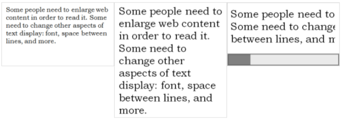
Some people need to enlarge web content in order to read it. Some people need to change other aspects of text display: font, line spacing and more.
Most browsers allow users to change the size of text through:
- text size settings (usually through Options or Preferences)
- zooming of text only
- zooming the page (which also zooms images, buttons, etc.).
When pages are not designed correctly, they can be unusable when the text size is changed, especially when it is changed through text-only zoom or text settings. Sometimes columns and sections overlap, the space between lines disappears, lines of text become too long, or the text disappears.
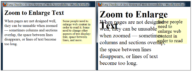
When the text size is increased, sometimes part of the sentences are not visible and users have to scroll horizontally to read a sentence, as shown in the third example below. Most people cannot effectively read text that requires horizontal scrolling, and some disabilities make this impossible.
What to check for
- All text gets larger (A common problem is that text is not provided as actual text format but instead the text is in an image. Text in images does not get larger when users increase text size).
- Text doesn’t disappear or get cut off.
- Text, images, and other content do not overlap.
- All buttons, form fields, and other controls are visible and usable.
- Horizontal scrolling is not required to read sentences or “blocks of text”. It is best practice that when text size is increased, all the text in a sentence is visible. It is acceptable to have to scroll horizontally to get to different sections of a page. (For top-to-bottom languages, change “horizontal scrolling” to “vertical scrolling”.)
References
- Resize text — Understanding Success Criterion 1.4.4 for WCAG (Level AA)
- Images of Text — Understanding Success Criterion 1.4.5 for WCAG (Level AA)
Keyboard access and visual focus
Many people cannot use a mouse and rely on the keyboard to interact with the web. Blind people and some sighted people with mobility problems rely on the keyboard or on assistive technologies that rely on keyboard commands, such as voice commands. Accessible websites allow people to access all content and functionality — links, forms, multimedia controls, etc — through a keyboard.
The keyboard focus should be visible and should follow a logical order through the page elements. The visible keyboard focus could be a border or a highlight, which moves as you scroll through the web page.
What to check for
- Tab to all: Check that you can tab to all the elements, including links, form fields, buttons, and media player controls. (A common problem is that you cannot tab to media player controls.)
- Tab away: Check that you can tab away from all elements that you can tab into. (A common problem is the keyboard focus gets caught in media controls and you cannot get out; it’s called the “keyboard trap”.)
- Tab order: Check that the tab order follows the logical reading order (e.g., for left-to-right languages: top to bottom, left to right) in sequence.
- Visual focus: Check that the focus is clearly visible as you tab through the elements, that is, you can tell which element has focus, e.g., links have a gray outline around them or are highlighted.
- All functionality by keyboard: Check that you can do everything with the keyboard; that is, you don’t need the mouse to activate actions, options, visible changes, and other functionality. (A common problem is that some functionality is available only with mouse hover, and is not available with keyboard focus.)
- Drop-down lists: Check that after you tab into a drop-down list, you can use the arrow keys to move through all the options without triggering an action. (A common problem for drop-downs used for navigation is that as soon as you arrow down, it automatically selects the first item in the list and goes to a new page — you cannot get to other items in the list.)
- Image links: Check that when images are links, they have clear visual focus and can be activated using the keyboard (usually by pressing the Enter key).
References
- Functionality is available from a keyboard (within “Accessibility Principles”)
- Browsing the Web by Keyboard (within “Better Web Browsing: Tips for Customizing Your Computer”)
- Guideline 2.1: Make all functionality available from a keyboard.
- Keyboard — Understanding Success Criterion 2.1.1 for WCAG (Level A)
- No Keyboard Trap — Understanding Success Criterion 2.1.2 for WCAG (Level A)
- Focus Order — Understanding Success Criterion 2.4.3 for WCAG (Level A)
- Focus Visible — Understanding Success Criterion 2.4.7 for WCAG (Level AA)

Forms, labels and errors
Labels, keyboard access, clear instructions and effective error handling are important for the accessibility of forms.
Form fields and other controls usually have visible labels, such as “Email address” as a label for a text field.
When these labels are marked correctly, users can interact with them using only the keyboard, using voice input and screen readers. In addition, the label itself becomes clickable, increasing the target area and making it easier to select small radio buttons or checkboxes.
What to check for
Find any form on the page. A form could be a single text box, or it could be a complex form with text fields, radi buttons, checkboxes, drop-down lists and buttons.
- Keyboard access
Check that all form controls are keyboard accessible by following the keyboard access controls above, including the control that you can reach all items in any drop-down list. - Labels
Check that each form control has a label associated with it using ‘label’, ‘for’ and ‘id’, as shown in the label controls below. (This is best practice in most cases, although it is not a requirement because the label of a form control can be associated in other ways).
Check that the labels are positioned correctly. For left-to-right languages, labels should usually be: text boxes and drop-down lists on the left, radio buttons and checkboxes on the right. - Required fields and other instructions
Check that all fields that are required/mandatory are clearly marked.
Check that the indicator does not rely solely on colour, e.g. if mandatory fields were only indicated by red labels, they would not be accessible to people who cannot see the different colours.
Check that the indicator (such as asterisks (*)) is included in the marked field label for text boxes and drop-down lists, or in the legend for radio buttons and checkboxes, as shown in the label controls below.
Check that all instructions for completing the form are earlier than necessary, for example,
General instructions should usually be at the beginning of the form or section to which they relate.
Check that the required formats, such as dates (year-month-date in the format 0000–00–00), are included in the marked label, using the label controls below. - Error handling
Some simple forms, such as a single search field, may have no errors. If you think the form(s) on the page you are checking may have error messages, try leaving mandatory fields blank or entering incorrectly formatted information (such as phone number or email address), then submit the form.
If you get errors, check that clear and specific guidance is provided to help people understand and resolve the error. If the error concerns a format such as date, time or address, check that the correct format is clearly explained.
Check that errors are easy to find. It is usually better to have error messages displayed before the form, rather than after it.
Check that the fields without errors are still populated with the data you have entered. (Users should not have to re-enter all the information in the form, except for some sensitive data such as credit card numbers).
References
- Labels or Instructions — Understanding Success Criterion 3.3.2 for WCAG (Level A)
- Info and Relationships — Understanding Success Criterion 1.3.1 for WCAG (Level A)
- Error Identification — Understanding Success Criterion 3.3.1 for WCAG (Level A)
- Error Suggestion — Understanding Success Criterion 3.3.3 for WCAG (Level AA)
- Error Prevention (Legal, Financial, Data) — Understanding Success Criterion 3.3.4 for WCAG (Level AA)
Moving or flashing content
Moving or flashing content includes carousels, ads, videos, automatically updating action tickers, scrolling news feeds and more. Users need to be able to control moving content, especially people with attention deficit or visual processing disorders.
Potential accessibility issues with moving or flashing content include:
- Comprehension of moving information — Some people read and process information slowly. Content may disappear before users have time to read it. Some people have difficulty following moving objects.
- Distraction from moving content — Moving content can make it difficult to concentrate and read; users cannot concentrate on some content because movement to another area of the web page draws their attention.
- In addition, flashing or blinking content can cause seizures in people with photosensitive epilepsy, particularly if it flashes more than three times in one second, covers a sufficiently large area of the screen or if it is too bright.
What to check for
- Check if there is any moving, blinking, or scrolling information that starts automatically and lasts more than five seconds. If there is, check that there is a way for the user to pause, stop, or hide the movement.
- Check if there is any auto-updated information (such as stock price). If there is, check that there is a way for the user to pause, stop, or hide the updated information, or for the user to control the frequency of the update.
- Check that no content flashes or blinks more than three times in one second.
References
- Pause, Stop, Hide — Understanding Success Criterion 2.2.2 for WCAG (Level A)
- Carousel Animations — WAI Web Accessibility Tutorial
- Three Flashes or Below Threshold Understanding Success Criterion 2.3.1 for WCAG (Level A)

Alternatives to multimedia content (video, audio)
Information in podcasts or other audio is not available to people who are deaf or some people with hearing impairments, unless it is provided in an alternative format such as captions and text transcripts.
Visual information in videos is not available to people who are blind or to some people with visual impairments, unless it is provided in an alternative format such as audio or text. (Text can be read by a screen reader or Braille display, or enlarged and reformatted for visually impaired people).
(Remember that these checks are not complete or definitive).
What to check for
- Keyboard access — Follow the steps above for keyboard access to ensure that the media player controls are labeled and keyboard accessible.
- Auto-start control — It is best if audio (including background noise and video with sound) does not start automatically when a web page opens. If it does start automatically, it should either stop after 3 seconds, include controls to pause or stop the audio and include controls to turn down the volume.
- Captions — (Captions are known as “subtitles” in some areas.) Most video on the web that provides captions has “closed captions” that can be turned on and off. (“Open captions” are always shown.) For example, in YouTube, you turn on captions with the CC button (no known keyboard access). If there is not a CC button, there are no captions available for that video.
Automatic captions are not sufficient for accessibility because they are not accurate enough.
Captions in the specific language need to be listed.
If there are captions, you can check that: the captions seem in sync with the spoken content; the people who are speaking are identified when they speak; important sound other than dialogue — e.g., footsteps approaching, doors closing, glass breaking — is included. - Transcript — It is best practice to provide both captions and transcripts, although not always required; providing transcripts has many benefits — both to people with disabilities and to website owners.
Transcripts should be easy to find near the audio/video itself and any links to the audio/video.
Check that transcripts include all audio information, including dialogue with the speakers identified, and all important sound — e.g., footsteps approaching, doors closing, glass breaking.
A transcript for a video could provide all the audio and all the visual information, so that a person can get all the content of the video by reading the text. - Audio description — Audio description (sometimes known as described video, video description, or visual interpretation) is description of important visual information in a video, in order to make it accessible to people who cannot see. For example, some videos start out with a title in text, have speaker names in text, and have illustrations. That visual information needs to be provided to people who cannot see the video. It can be provided through audio description and text transcript.

Basic structure check
While the other checks on this page focus on specific success criteria in WCAG, this check is more broad. It helps you understand how some people “see” the web page differently. For this basic structure check, you look at the web page without images, styles, and layout.
Web pages are often designed with multiple columns, sections, colors, and other visual aspects that help organize information for people who see the page in its default display. However, some people do not see the page this way. People who are blind listen to the page with a screen reader or read it from a Braille display. Some people with low vision and others change the way the page is displayed so they can read it; for example, change from multiple columns to one column, change the text size, and more.
An important issue is how the web page works when it is “linearized” into one column and the presentation is changed.
While it is useful to have an experienced screen reader user check web pages, anyone can get an initial idea of potential accessibility barriers for screen reader users and others who change the way the page is presented. The steps below show you how to disable images, disable styles for how the page is usually displayed, and linearize the page to check the page structure.
Notes: data tables will not make sense when linearized — that’s OK because screen readers have functionality to make data tables usable (when they are marked up correctly).
What to do
Get a basic structure view of the page by following the instructions under Basic structure checks below to:
- Turn off images and show the text alternatives.
- Turn off style sheets (CSS), which specifies how the page is displayed with layout, colors, etc.
- Linearize the page or the tables (depending on the toolbar).
What to check for
- Check that the information makes sense when read in the order it is shown; for example, headings are right above the information they apply to.
- Check that the alternative text provides adequate information for the missing images.
- Check that blocks of information have clear headings. When navigation, main content, and other sections have good headings, it’s easier for people to find their way around the information.
Code validation
Once the above points have been checked, carry out a validation of the source code of the web pages via http://validator.w3.org/.
Tools
Web accessibility evaluation tools are software or online services that help determine whether the content of a web page meets accessibility standards.
The W3C provides a list with more than 100 tools that you can use. You can use the filters to narrow down the list to the types of tools you are interested in.
In particular, two tools that are recommended to be used are:
- WAVE — WAVE can identify many accessibility and Web Content Accessibility Guideline (WCAG) errors, but it also facilitates human evaluation of web content.
You can use the WAVE tool online by entering the address of a web page (URL). WAVE extensions for Firefox and Chrome are also available to test accessibility directly within your web browser — this is particularly convenient for checking password-protected or locally stored pages. - Markup Validation Service — W3C’s online tool for assessing the code quality of web pages.
What evaluation tools can and cannot do
Web accessibility assessment tools can help to quickly identify potential accessibility problems. They can be used at all stages of the web design and development process.
These tools can provide fully automated checks and help with manual review.
However, it is not possible to check all aspects of accessibility automatically. A human point of view is needed. Sometimes assessment tools can produce false or misleading results.
Accessibility evaluation tools cannot determine accessibility, they can only help to do so.
Features of Evaluation Tools
Web accessibility evaluation tools target different audiences. This includes designers, developers, non-technical content authors, quality assurance testers, and sometimes also end-users. Tools offer different features and functionality which may help users to compare and assess web accessibility evaluation tools for their specific needs.
Main features
- Guidelines
Different organizations and governments may require conformance with different accessibility standards, thus different tools support these standards. The W3C Web Content Accessibility Guidelines (WCAG) is internationally recognized as the standard for web accessibility, and supported by most tools. - Language
Evaluation tools support different languages. This includes the user interface of the tools, as well as the language of the content they support (for example, for detecting language-related barriers). - Type of Tool
Evaluation tools can be plugins (extensions) for authoring tools and web browsers, command line tools, desktop or mobile applications, and online services. Different tools may be combined, depending on your design and development process. - Supported Formats
Most evaluation tools check the accessibility of HTML content. Some check other web technologies, such as WAI-ARIA, CSS, SVG, and PDF. - Assists by
Some web accessibility evaluation tools can be used in more than one way. The following are some common characteristics used to support the evaluation process:
a) Reports are useful to determine the conformance of the checkpoints that can be automatically checked.
b) Step-by-step evaluations: Wizard-based evaluation tools guide users through sequences of checks. They conduct automated checks and prompt the user to manually assess the rest. For example, a wizard-based tool may check images for alternate text. The user then evaluates how appropriate the alternate text is.
c) In-page feedback: This feature inserts temporary icons and markup to display results of accessibility checks. They are useful to view issues in context. They are also useful to understand the relative importance of each issue.
d) Page transformation: Transformation tools change the appearance of a site to help identify design issues. For example, the tool may show the site in text only or without color. These tools are useful to compensate for the limitations of automated testing. - Automatically Checks
The scope of what the evaluation tool can automatically test varies depending on the tool. Some tools check a single page, while others check entire groups of related pages. Some can also access password-restricted content. - License
Evaluation tools are available under a variety of license types, such as Open Source, Commercial, Enterprise, etc. - Accessibility Information
It is important that evaluation tools are accessible so that people with disabilities can use them. Some tools provide information on how well they support accessibility.
More detailed features
- Authoring Tool Plugins
Such plugin tools often assist non-technical content authors to check the content they are creating directly within their authoring tools. These include MS Word, Adobe Acrobat, content management systems, as well as other tools. - API
Some authoring and quality assurance tools can access some evaluation tools directly. The evaluation tools offer different types of APIs to allow this interaction. - Browser Plugin
Such plugins may assist web designers, quality assurance testers, and evaluation experts to check content directly within the browser. - Online Service
Evaluation tools provide different types of online services:
a) Online checkers often are websites where you can enter your own website’s address to get it checked. Sometimes this may also be a web service accessed through an API by authoring or quality assurance tools.
b) Hosted services can regularly check your entire website and provide reports on improvements over time. They may also offer other solutions for enterprises. Usually these require subscription with the tool vendor.
c) Server installation of some evaluation tools provides an integrated way to check your entire website on your internal network. They can sometimes check password-restricted or draft content. - Report Format
Many tools generate report formats such as HTML, CSV, PDF, XML, etc.
References
- Evaluating Web Accessibility Overview — https://www.w3.org/WAI/test-evaluate/
- Quick Accessibility Tests (YouTube channel) — https://www.youtube.com/playlist?list=PLTqm2yVMMUKWTr9XWdW5hJ9tk512Ow0SE
- Reviewing a design for accessibility — https://www.a11yproject.com/posts/2021-08-14-reviewing-a-design-for-accessibility/
